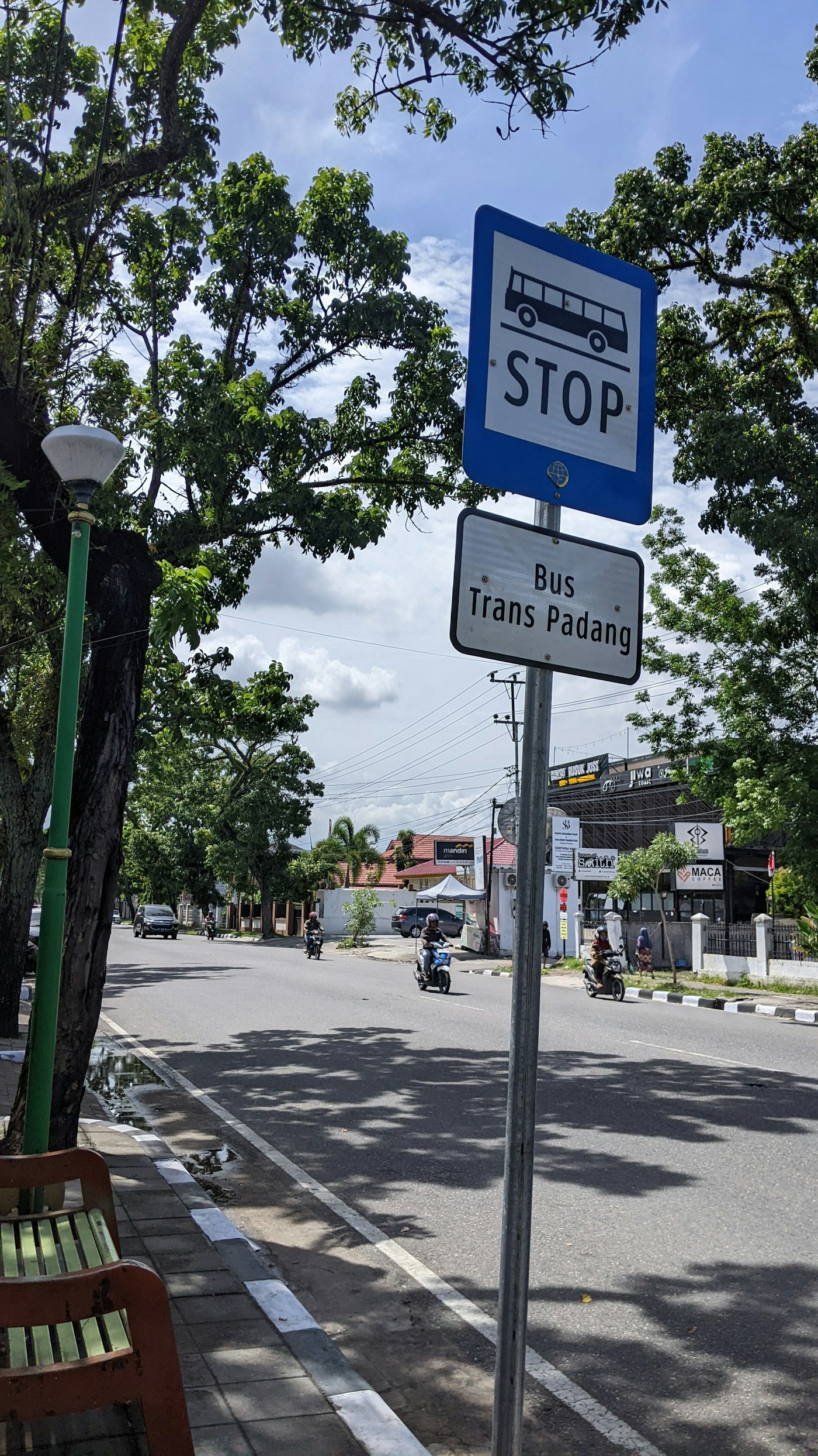
Clear directions turn unfamiliar infrastructure into a usable journey.
The knowledge regular passengers stop noticing
A frequent passenger may know which staircase leads to the right platform even when the sign is ambiguous. A newcomer has no such memory and must interpret the environment while carrying luggage, watching the time or helping another person. What looks obvious to a designer or regular user can therefore be the most difficult point in the journey.
Show the decision before the turn
Directions are useful when people can see them before choosing a route. Station names, platform numbers and exit information should remain consistent across signs, screens and maps. An instruction that arrives after the stairs forces someone to backtrack. Simple language and recognizable symbols help, but they need to correspond to actual pathways rather than decorate a confusing layout.
Test the complete journey
Follow a first-time visitor from the street to the platform and then toward an unfamiliar exit. Notice where they stop, look back or ask another person. Include routes that avoid stairs and consider what happens when a lift is unavailable. Accessibility information should explain a workable alternative, not merely announce a problem. The whole sequence matters more than the quality of any one isolated sign.
A usable system does not require passengers to arrive already knowing it.
A thought to take with you
Good wayfinding often disappears from attention because the journey feels straightforward. That quiet success is worth valuing as part of transport service, alongside the vehicles and timetables that receive more visible attention.
An opinion essay prepared by The Everyday Observer with AI assistance, not a field report or survey. Images illustrate themes rather than specific people or events.